Spring fever is in the air! Every year colorful blossoms slowly emerge, bringing us happiness and joy.
This year I’m excited to be welcoming spring with a talk on flowers and art. This upbeat subject will inspire and uplift us all.
You are invited!
The Scarsdale Public Library graciously invited me to return to present Creativity in Bloom: Flowers and Art on Tuesday, March 25 at 4:30pm. The event will last an hour – 45 minute talk plus questions, followed by refreshments.
The flowers topic is a bit of a change from my previous food presentation at the library called A Bite-Size Talk of Food in Art, which was well received, and included an exhibit of my food paintings. Edward Patrick Grigg will be exhibiting travel related pieces at the library during the month of March.
Registration Requested
Click here to register to come In-Person or attend Online. It’s especially important to register in advance if you’re attending virtually to receive the zoom link an hour before the presentation begins. And it will begin on time. Registration closes 3:00pm on Tuesday, March 25.
Bring a bit of an appetite since Bonnie, my younger daughter, is serving light refreshments. A rough head count will help her plan quantities of “bites” and drinks.
And how could we not serve food? It’s a long standing tradition at any Shipko event.
Transportation
The Scarsdale Public Library is located at 54 Olmsted Road, in Scarsdale, NY right off Boston Post Road in Southern Westchester Country. For those who plan to drive, parking is plentiful in the library lot and on the nearby side streets. Because of the positive response to this talk, and other simultaneous library events, parking could be more challenging than usual. Please allow extra to park.
For non-drivers from NYC, the Scarsdale train station is on the Metro-North Railroad’s Harlem Line from Grand Central Station. The station is fairly close (1.6 miles or 5 minutes) and easily accessible by taxi, Lyft or Uber.
Questions?
Finally, for additional information, please go to the website at scarsdalelibrary.org or call (914) 722-1302. You can always contact me directly at beverlyshipko@mac.com or 914-954-7779.
Now the question for me is how is to organize and condense a massive amount of material on this epic topic. I hope you’ll let me know how I did afterwards…
As always, I am looking forward to seeing you on March 25, and ushering in the delightful world of flowers!
Recently I had the good fortune to be in Los Angeles and see the Keith Haring show, which had caught my eye on a list of 12 Must See Art Show in artnet news.
Exceeded Expectations
Art is for Everybody is an appropriate name for a show with such a breadth and diversity of medium and subject matter. This show is provocative, stimulating, and fun. Most of all it’s accessible, which was Haring’s oft proclaimed intention. It feels very timely even though much of this work was done in the 70s and 80s (1968-1990). And Haring only lived to age 31.
Bottom line: It exceeded my expectations. That’s what I want you to take away from this blog. The Keith Haring exhibit at The Broad, a contemporary museum in downtown Los Angeles, CA runs thru October 8, 2023. Read on for the details (and there are many! Hopefully not too many…).
I wasn’t the only one who felt this way. You can see Bonnie enjoying herself below. This was one show where I didn’t have to ask anyone to interact with the paintings – it just happened spontaneously! Haring’s love of dancing and music comes through in his work and is contagious.
But is Keith Haring’s art really for everyone? Or is it more accurate to say it’s accessible to everyone?
Certainly it’s simplified bold strokes and colors, dancing figures and barking dogs won’t appeal to everyone, especially art fans primarily drawn to traditional chiaroscuro paintings. While it’s not intended to be highbrow, it’s energetic shapes, bright colors, and diversity of subjects tend to appeal to younger generations who are receptive to new art concepts and constructs.
Haring essentially created his own visual language that is easily recognizable.
Recreation of 1982 Major Show at Tony Shafrazi Gallery, NYC
My most recent exposure to Keith Haring was during several Street Art lectures via zoom during the pandemic. I was prepared for a raw feeling that is typical of that genre.
Instead, this splash of sophisticated and bright neon-color greeted us, signaling this show was going to be different. As you can see, Bonne got into the swing of things right away.
Keith Haring 1982 Statue of Liberty… and Bonnie
Upon closer viewing, you can see the Statue of Liberty is covered with Keith Haring’s recognizable marks.
This painting was inspired by NYC and the break dancing of the 50s and 60s. All the works in this room shared bold lines, colors and shapes, along with Haring’s signature people.
Art Historical Influences
Keith Haring surprised me by displaying an awareness of art history, which didn’t fit with my preconception of him as a graffiti artist. This section shows the influence of early Greek vase painting patterns, which we had seen at Getty Villa in Malibu the day before.
Here’s a photo I happened to take at the Getty Villa Museum (which is a lovely way to spend an hour or two). Notice how Haring appropriated the geometric banding concept and unglazed terracotta in his vases, but we see Haring’s dogs and human figures in the registers instead.
Etruscan Vase from the Getty Villa Museum, photo by Beverly Shipko.
Influence of Indigenous Cultures
My favorite room was this one with 3 totem-like sculptures set amidst huge patterned Haring paintings. These bold, whimsically shaped totem had an indigenous feel from South America. Also they were very creative, and had such a distinctive character. Bravo!
When you got closer, you could see that each was engraved with unmistakably Haring imagery in yellow and against the black.
I particularly liked this view of the gallery, which evoked the complex patterns of Mayan and Aztec art that permeated South American cultures. Click here for an example of a typical Mayan portal to see what I mean.
The curators did an excellent job of placing the objects, and coordinating patterns of the paintings and sculptures so they played off of each other, creating a playful space with a lot of movement and energy.
Art History References
When I first saw work below, I thought about Michelangelo’s Creation on the ceiling of the Vatican’s Sistine Chapel. And then I turned the corner to read how he drew on art history and cultures for his imagery – specifically the Vatican. The irony of these naked creatures – with their tongues hanging out – imitating famous Vatican art was not lost on me. Only here we’re witnessing the creation of consumerism vs. the creation of Adam.
Haring hung out with a group of well known Manhattan artists, including Andy Warhol. Rhese paintings are his personal tribute Andy Warhol and his repeated imagery (think Campbell Soup Cans) with its consumerism theme.
This Tree of Life is a symbol that is traceable through all of art history. This was one of the more lyrical, optimistic and peaceful images in the show, with happy colors. I wish I had taken a photo of the wall tag to confirm there isn’t some sinister meaning behind it… as in many of his other pieces.
X Rated
Of course, no Haring show would be complete without a few sexual images and more than a few penises.
Art and Activism
Haring spent a chunk of his short career trying to change the world by calling awareness to issues that troubled him. He was fearless when confronting the establishment, whether he was expressing his strong views on AIDS (which ultimately took his life), apartheid and global social justice, systemic racism, capitalism, or the atomic bomb and nuclear warfare..
There are a lot of different interpretations of Haring’s work, but the following images indicate he was an original who pushed the boundaries of expression. He constantly experimented. He had courage to make and create art that would make viewers uncomfortable.
Capitalism
One of his favorite themes that he often returned to is capitalism, which he presented with the stereotypicial “capitalist pig”. As explained in the wall texts, Haring often used this image “in political cartoons to depict greedy businessmen… Haring’s pig paintings comment on the ills of capitalism and abuses of power in the name of profit.”
This work is a good example of a brightly colored Haring paintings with a very dark message.
Keith Haring, Untitled, 1983, Acrylic and enamel on canvas.
“This tarp painting portrays a pig spewing money-green vomit made up of computers, TVS, clocks, airplane, and other objects of modern life. The green vomit occupies the ground of the painting out of which little figures climb, suckling the sickly peg’s teats. This work is a monstrous depiction of the struggle of production in an era when everything was deemed consumable.”
In this next tarp painting, we see a weapon piercing the central handcuffed figure, representing a tool of oppression. The bleeding globe we see here often represents the worldwide social ills, including systemic racism right here in New York.
Systemic Racism, Social Injustice and Aparteid
In this particular work, red represents blood of a specific person, Michael Stewart, as well as the blood of the world. Michael Stewart was a young black artist, a student at Pratt Institute, who was brutally arrested for writing graffiti in NYC and died after spending 13 days in a coma. This work was created to call attention to systemic racism and social injustice right here in New York.
In addition, the bleeding globe is a symbol Haring often used to represent the ills of institutionalized racial issues such as segregation, in this case apartheid in South Africa – as indicated in the title that references Africa. Yet the US maintained trade ties with the country ostensibly to neutralize off the Soviet Union during the Cold War. In this respect, the red represents the blood of the world. The yellow figures remind me of the quote: “See no evil, hear no evil, speak no evil”.
Keith Haring, “Michael Stewart – USA for Africa,” 1985
Here’s another piercing of body parts by the devil himself using a long Pinnochio like nose as a sword. It’s an unusually powerful horizontal image, and I can only imagine what it means since I can’t read the wall plaque… Please feel free to use your own imaginations.
Frustrated by AIDS
Haring was a visible AIDS advocate, and used his talent to bring attention to the magnitude of the crisis. Here he promoted safe sex and the AIDS hotline. After being diagnosed with AIDS in 1998, he created the Keith Haring Foundation to provide funding to AIDS organizations to support education, research and care.
Keith Haring as a Capitalist Pig
Given his desire to fight against consumerism and for the oppressed underdog, it feels like a contradiction in terms that Haring embraced consumerism. He opened his own Soho Pop Shop which sold Haring branded merchandise in lower Manhattan.
A 1988 painting by Haring and items from his Pop Shop
Now you too can own Keith Haring slippers and refrigerator magnets!
Haring argues that his Pop Shop is a legitimate alternative avenue to reach the mass audience. And certainly we’ve all bought branded merchandise. But after making fun of the “capitalist pig”, Keith Haring essentially becomes one by opening this store.
End of Life Works
Similar to other artists, Haring’s last paintings foreshowed the end of his life. They have an unfinished quality and missing pieces. It’s almost as if he’s commenting on the work he still wanted to do to change the world.
To me, these two painting feel incomplete and yet satisfying at the same time. They provide a proper coda to a distinguished career.
Love
On the way out, there’s a mirror where Bonnie and I took pictures that summarized our feelings about this show.
In case you noticed, that is me in a wheelchair still recovering from a March leg injury. I enjoyed the show with Bonnie’s help.
Thanks to these two ladies for making it a wonderful day, especially Lauren who had the foresight to buy tickets way in advance.
It certainly looks like Lauren and Natalie loved the show too!
But the Keith Haring exhibit was the standout show. It’s so relevant today. That’s what I remember and recommend when I’m talking to people about my CA trip.
The rest of The Broad Museum has some pretty stellar art, enough that it’s worthy of a separate blog should I ever get around to it.
If you’re in LA before October 8th, I would highly recommend that you purchase tickets in advance for the show. Weekends are selling out quickly. It’s probably easier to get weekday tickets.
Is Haring’s art really for everybody?
That’s still the burning question. While your initial reaction may be “No, this art isn’t for me”, there’s an excellent chance it is for your kids and grandkids. So bring the family.
And if nothing else, you can appreciate a contemporary artist who was marching to his own drummer in his goal to create positive change.
Haring believed that art made the world a better place. It was his mission.
Today his art and activism deeply resonates in the upheavals that have occurred around the world. Many paradigm shifts have occurred following COVID. The pandemic brought many issues to the surface, including more awareness of inequities, racial issues (#Black Lives Matter); identity (#LGBTQI); plus Diversity, Equity, Inclusion, and Belonging (#DEI).
The world has evolved in many ways since Haring passed away in 1990. Yet the big unresolved issues feel somewhat the same, perhaps even more pressing today.
It’s important that we become more aware, tolerant and accepting of the inevitable social, economic and political change that is taking place outside of our own little silos. And hopefully there will be some compassion in the mix that will bring help to people who need it most. And Haring saw art as his tool to do just that.
In that sense, Keith Haring’s art is for everybody!
Today I had a little local art adventure – something new to me. I joined the Westchester Sketchers Group (no, not the shoes!) at the Neuberger Museum in Purchase, NY for an afternoon of sketching, sharing and chatting about art.
The Unexpected Sketch
I came home with this. Not at all what I anticipated going in since abstraction isn’t my thing. Quite a bit different from my typical food paintings, right? This abstract composition doesn’t even resemble any of the compositions in my Challenge paintings!
My interpretation of Louise Nevelson, 1973 at the Neuberger Museum
A Global Urban Sketchers Community
This is my second Westchester Sketchers event. The first being last week at the Hudson River Museum in Yonkers. This time around I knew what to expect. Thank you to my friend Betty for introducing me to this group, which is essentially a subsidiary of NYC Urban Sketchers and complement to NJ Sketchers. Both Urban Sketchers groups are a part of a worldwide sketching movement called Urban Sketchers. Who knew?
Their global motto is, “See the world one sketch at a time.” And maybe that’s what I’m going to do… starting by experiencing Westchester County and NYC from this new perspective.
The group meets in the lobby of the museum. Then we have about 2 1/2 hours to wander around the museum and choose something appealing to sketch, and create an image using dry materials (since we’re indoors in a museum). Afterwards, we share our work, and talk about the process.
My Process
After wandering around the museum the first time, nothing resonated with me. So I meandered through a second time. I remained undecided.
I considered these two pieces of art. Ultimately, I passed on the Richter since I thought it would do better in color (which I didn’t have). The African sculpture was still a possibility. Eventually I realized I was short on time (already lost an hour) so I better pick something and just do it!.
You can see another member of the group sketching away in front of this African sculpture.
Hans Richter, Wall Wood Relief IV, c. 1970 by Richter.
Eventually I paused at this Louis Nevelson (below) after reading the title. Even though it’s a black wooden wall relief, it is called Day/Night XX. This name intrigued me since I thought the more appropriate title would be Night, with Day being a white version of this wall relief. And Nevelson did work in white.
So I decided to sketch this as if it the original Nevelson before me was white and titled Day.
Materials
I sketched the whole drawing freehand, often standing (which I do at home when painting on an easel), using a soft graphite pencil (on the right) with a kneaded rubber eraser. (Note to self: Throw a ruler in my bag next time.) The smooth, stiff paper is called Bristol board, which I use for my 6 x 6 inch Oreo Cookie drawings. This was about 2/3 done.
Kneaded eraser, 6 x 6 inch Bristol board, and a soft artist pencil.
All of a sudden there was only 15 minutes left to add the contrasting, darker shading and small details, like the little staples holding those horizontal wires and the shadows on the horizontal molding near the bottom.
Time to stop and meet up with my fellow sketchers, uncomfortable though that is. The “final” version.
As I look at this, I realize my choice of subject was at least partially driven by my left-sided math brain, which was always drawn to geometry when I was a math major. How I always loved the challenge of solving geometric math problems! I guess I still do only in a different way.
Stretching or Sketching Outside My Comfort Zone?
Overall, today was a positive experience – even if I was uncomfortable going in. More so last week when it was my first time. Usually my paintings are carefully thought out, often ruminating in my head for weeks. Quick sketches are a radical departure for me.
However, I believe it’s a good thing to try new approaches and get out of my comfort zone. And to open myself up to different comments from other artists, as well to see how other artists approach this challenge. That’s how we all grow artistically and unlock new opportunities.
And no, the headline is not a typo. The best headline that captures the spirit of today is still Sketching Outside My Comfort Zone and not stretching – although I did a lot of both today and especially over the past few weeks.
Maybe that could be the subject of my next blog….!
What a gorgeous day it was when I went to the New York Botannical Gardens to see Kusama: Cosmic Nature which runs through October 31, 2021. 65 degrees and sunny. Perfect. I still get excited to see art again in person instead of on zoom.
Knowing I was seeing a sculpture installation by Kusama, aka The Dot Lady, I put on my polka-dot mask to get in the spirit of things. And what do you think greeted me at the entrance to the garden?
Polka dots, of course! I fit right in.
The cool thing about this sculpture was how dramatically it changed as you walked around this whimsical sculpture, called I Want to Fly to the Universe.
From the back, it looked like a completely different sculpture.
What I like most about the Kusama show is the variety of the installations. It turned out to be important to look at the map to see the highlights.
For example, one unassuming building near the entrance delighted with a mesmerizing experience of being indoors in an unending room of light-infused polka dotted pumpkins, called Pumpkins Screaming About Love Beyond Infinity, 2017. I would have totally missed this without the map.
A short distance away, I came upon this green house-like structure teeming with red flowers of sorts, appropriated named Flower Obsession.
As I waited online to enter, I was given this sticker on plastic and was invited to place it where I wanted. This was truly a participatory, interactive experience, a nice change of pace.
When I walked in, I could see flowers everywhere! From the wheel barrow, to the dining room table and chairs, everything was covered in red flower stickers. I took my time looking, carefully picking the territory I wanted to mark with my sticker.
I finally found some virgin territory on this philodendron plant in the corner. You can see my sticker on the right side of the leaf. It felt strange putting a sticker on a living plant, but I did it anyway. Notice how different stickers with blue centers and larger pink-ish daisies had been handed out to previous visitors.
Then I headed off to the conservatory, but was drawn instead to this large polka dotted series of irregularly shaped fingers, which turned out to be a pumpkin in motion. You can feel the motion from this view. I probably should have figured out this was a pumpkin since Kusami is obsessed with them, which she exhibits frequently around NYC and the world.
While I was waiting in line to walk through Dancing Pumpkin, a fellow visitor actually asked me if I planned my mask around the visit! Someone actually noticed.
I had plenty of time to study this view since only a few people were admitted at a time, not so much from covid precautions, as much as to prevent damage from having too many visitors walk through. The guard said this artwork had already been repaired several times.
As I finally approached Dancing Pumpkin, these finger like projections beckoned, and somehow reminded me of Louise Bourgeoise’s spidersculptures; I’m not sure why. Maybe because these spiders and pumpkin installation are so large, and are both representative sculptures with “legs” that you walk through, unlike so many abstract installations, such as those by Richard Serra. (Ok, maybe the spider comparison seems like a stretch….but it works for me.)
This is the view from inside out, where the pumpkin’s legs look like octopus tentacles or giant drips, take your pick. Ever hear of an old horror movie called The Blob?
I decided to look for a signature and finally found it.
After the Dancing Pumpkin detour, I wandered over to the ticketed Enid A. Haupt Conservatory show to be greeted by this series of whimsical, exuberant polka dotted flowers – which seemed to carry on the dancing theme.
I was delighted to find this monumental golden pumpkin hidden amidst a larger greenhouse installation, but it felt so static after seeing and experiencing Dancing Pumpkin and those exuberant flowers.
There were more polka dotted flower sculptures installed in the outdoor reflecting pool.
I couldn’t resist taking photos of these vibrant tulips scattered around the perimeter of the reflecting pool, I wondered if I could ever paint them, but they look unreal to begin with. Maybe I’ll stick to photography…
I could see the Infinity Mirror Room from a distance, which was closed when I went due to covid.
Webmaster Laura was kind enough to share her more recent photos of the Infinity Mirrored Room, saving me the $10 entry fee.
Kusama’s installations are very cool! And this one looks particularly colorful.
Then I encountered a series of white on red polka-dotted wrapped trees, a la Christo’s wrapped installations of islands, the Arc de Triumph, and more. Kusama presents us with her own unique perspective on wrapping in Ascension of Polka Dots on the Trees.
Polka Dot Row, Photo by Webmaster Laura Sloofman
Finally, I went in to the LuEsther T. Mertz Library Building to see the Cosmic Nature show. Can’t miss that polka dot banner, can you?
More polka dotted cellular creatures greeted you in the entrance hall.
As I entered the gallery, I quickly encountered this sketchbook of flowers. Apparently Kusama filled numerous sketchbooks with flowers at a young age in Japan. I was enchanted by these drawings, which I couldn’t photograph myself, especially since our upcoming Ikebana lesson had us drawing details of our arrangements.
After studying the few Kusama’s drawing included in the exhibit, I was eager to get started on my own sketches. I hadn’t drawn flowers in years – I was too busy with food and vending machines.
As you moved deeper into the gallery, Kusama’s vibrant, whimsical, biomorphic cellular shapes and colors greet you, like old friends.
There was one painting called….that spoke to me. It called to mind my Cosmic Oreo.
By this time, it was past 1pm and I was hungry for lunch. My last stop on the map was this major installation. From a distance, I thought it only merited a quick walk through.
As I got closer to Narcissus Garden, 1996/2021, I realized I had been too quick to judge. I had underestimated the multisensory aspect of the installation. So I dug deep in my purse and found a small pumpkin seed snack bar (how appropriate for this show!) to tide me over.
The first surprise was that each sphere reflected the white fluffy clouds floating in the blue sky, like mini holograms of the cosmos.
Then, what looked like a static installation was anything but. The silver balls drifted slowly from side to side as the gentle breeze kicked up a notch. I took a seat and watched them move back and forth, which put me in a meditative state for a while.
Not only did the balls line themselves in natural rows, which was unexpected, but they clinked against each other making subtle sounds. The longer I stayed and the more present I became, the louder their “voices” seemed.
As I walked out, the balls were on their slow, steady march across the pond once again, accumulating along the opposite side.
This was a satisfying end to a lovely day.
I would highly recommend a visit to the NYBG to see the show, and to enjoy the gardens. The restaurants are open, which makes it easier to spend the day there. Reservations are required, and are sometimes more difficult to get than expected, even for members. So make reservations ahead of time especially on the last 3 weekends in October before Kusama Cosmic Nature closes.
Remember, if all else fails, you can probably get a Garden Pass to see everything in this blog post that’s outdoors – not to mention the rest of this expansive garden. I just made another weekday reservation for myself to stroll by and view Kusama’s whimsical installations again, this time against the beautiful ever-changing cosmic fall colors. I wonder if the silver balls in Narcissus Garden will be reflecting some rusts and reds this time around.
Something new and exciting crept onto my dinner plate tonight. And it’s an exuberant yellow and orange.
Here’s the backstory. Maybe you won’t be so surprised if you have read More Joy.
There’s been a silver lining for me during this pandemic.
Over a year ago, my sister-in-law, Leslie, reached out and asked if I would be interested in taking an Ikebana class from her over zoom, which she was trying to teach with for the first time (as was everyone when the pandemic began). Ikebana is the Japanese art of flower arrangement. I jumped at the chance to study Ikebana with her! And I asked my friend Carin if she wanted to join in the fun. There’s 5 of us on zoom every Monday morning, including Leslie.
For years, I’ve admired Leslie’s Ikebana arrangements from afar since we never lived on the same coast, let alone the same city. Leslie took her first Ikebana class after college, when she lived in Japan with her husband Leigh, who was stationed there for a few years.
I have been deeply touched by this class, which could perhaps be described as a mini-addiction – only rivaled by my obsession with painting food.
During class, Leslie has wondered out loud several times how Ikebana was going to affect my painting. So have I.
I have painted flowers before in my pre-food years. They tend to be focused, single images. One of my favorite flower paintings is hanging in my daughterBonnie‘s apartment. Purple is still her favorite color.
“Iris“, by Beverly Shipko, 1980s, Acrylic, 36 x 24 inches
During my small 30 Day Painting Challenges, I interspersed flowers among my subjects. I have always enjoyed flowers and admired Georgia O’Keefe’s bold images since I was a kid. You can read more about each of my flower paintings below – Sunflower, Peony, and Tiger Lily.
“Sunflower” by Beverly Shipko, Oil painting on panel, 6 x 6 inches“Peony” by Beverly Shipko, Oil painting on panel, 6 x 6 inches“Tiger Lily” by Beverly Shipko, Oil painting on panel, 6 x 6 inches
When I recently spotted a clamshell package of brightly colored edible flowers at a new local grocery store, Mom’s Organics Market, on an impulse I bought it.
Soon I discovered how much fun it is to liven up the plate with different colors and textures, and to cluster the flowers together as I do in my Ikebana arrangements. I laughed out loud when I realized I was playing with my food – something we discouraged the kids from doing when they were little. And I was having such a good time!
At the moment, I don’t know how Ikebana will affect my future paintings and body of work. However, I am excited to see the two worlds of Flowers and Food finally come together on this unconventional purple canvas that we call a plate.
A few days later, I went out and bought a bouquet of multicolored pink roses for my weekly zoom Ikebana class, which is the Japanese art of flower arrangement. Marie Kondo would have approved since the flowers sparked joy – in her words – and still do looking at these photos. The lesson was our first centerpiece, designed to be viewed from all angles including top down. So it did well on my low ottoman.
Of course, I couldn’t resist putting the final arrangement near the pink donut pillow and painting, where I could enjoy the combination every time I walked by. (Admittedly the day glow, hot pink pillow in the first photo somewhat overpowers the arrangement, but didn’t in real life.)
It wasn’t just the finished product that sparked joy (which I was initially not sure about), it was the process of assembling the entire centerpiece – and looking at it from every point of view. I was completely absorbed and challenged by the task at hand.
The hardest part was getting the first 3 branches in (actually 2 branches and a long stemmed rose) radiating outwards at 120 degree angles to each other. It was like drawing a math pie chart with 3 equal size pieces in flowers. Only it was more challenging since the center of the design is off to one side, as you can see below. I was struggling until I got out a step stool and looked straight down onto my kitchen counter, where I make my arrangements.
The low cluster of roses in the center went in last. It was an iterative process. Put a flower in, turn the container, take a flower out. Maybe put greenery in, and turn again. Raise a flower, shorten a flower. Turn. Made me think of that song Turn! Turn! Turn! (To Everything There Is ASeason) by The Byrds.
During our zoom class, I showed my finished arrangement for the end of class critique (just like art classes!) by turning the container the full 360 degrees with both hands. For this blog, I haven’t quite mastered the art of turning with one hand and taking a stable video with the other.
So here are a few of the still photos I took after class of Sogetsu Ikebana Variation No. 6 Horitzontal Style Moribana (meaning low container). Notice how water, with its reflections of light and color, is a key element in this arrangement.
Sometimes I’m not quite sure what my daughters truly think of my pink Ikebana arrangements. It’s fascinating that they both seem to avoid wearing pink (if at all), perhaps because it has Barbie-like connotations from old fashioned generations. I still enjoy putting on deep pink to brighten myself up, with its positive connotations of cotton candy, romance and sweet memories. In high school, Mom told me I looked great in pink, which I should wear if I wanted to “snaggle” a guy…
Ah, the joy of pink endures – aside from donuts. Now it’s manifesting itself creatively in a whole new and unanticipated way through the spirit of Ikebana.
I had a fabulous time on Thanksgiving 2020 – despite eating with my kids over Zoom – thanks to Chef Bonnie’s extraordinary culinary and planning skills.
My family and friends were almost afraid to ask about my Thanksgiving since they knew I would be eating alone. But the thing is, I didn’t feel alone at all! It was actually fun! I had plenty of company… starting with our traditional “Let’s Get Stuffed” family mascot… who was soon replaced as you can see here…
My Tablemates – Flat Laura and Flat BonniePLUS their zoom equivalents!
You might be wondering why the chairs say Flat Bonnie and Flat Laura. This was inspired by the Flat Stanley series of books, which Teacher-Chef Bonnie told me about, and Flat Stanley’s worldwide traveling adventures. The concept fit Bonnie’s 2020 Thanksgiving Feast very well since it was a traveling event. FYI. Here’s the official Flat Stanley 50th Anniversary template, if the spirit moves you to make your version.
Bonnie was determined to cook her usual feast, without any compromises – especially when it came to her signature popovers. She willingly undertook the challenge of cooking in her Manhattan galley kitchen and bringing the entire meal to me, with Laura’s help.
There were 4 basic phases to this traveling Thanksgiving event, both in Manhattan and Ardsley, N.Y. 30 minutes north of Manhattan.
Baking on Pie Night
Cooking the feast in Manhattan, which actually started 2 weeks earlier with a few side dishes (soup, cranberry sauce) that were frozen in advance.
Delivering the entire dinner to me in Ardsley, and sampling the desserts (yes, this is backwards, but it’s 2020 and the chef needed her sugar fix)
Driving back to Manhattan, baking more popovers, warming up dinner, and zooming with me. And taking lots of photos along the way!
Now for the details, and the devil is in the details.
Here’s Bonnie in 2020 rolling out one of the pie crusts on the big folding table that functioned as Bonnie’s living room work station, on loan from sister Laura for the big event. And then we can see the fruits of her labor.
Bonnie’s extended kitchen for the dayPumpkin Cheesecake Fresh Out of The OvenCherry Pie Filling on Bonnie’s New Non-Stick Miracle Pan from Our PlaceBonnie putting the finished almond touches on the Cherry Pie
Plus she made a Lattice Apple Pie. Bonnie always did like weaving loop potholders as a kid. Now she’s moved on to bigger and better things!
Phase 2 began on Thanksgiving Day, when Bonnie moved into high gear to cook her signature side dishes like Stuffin Muffins (3 versions this year!), which she had started prepping the night before. It’s a good thing Laura brought over such a big table!
Bonnie made the popovers in 2 shifts, which didn’t hit me until I saw these photos, the first round below being the GF popovers for me in Ardsley. I had just assumed the cooking was finished before they left. Wrong!
Then she got to work on the Stuffed Pears with Goat Cheese and Cranberries..
For the main course, Bonnie made her Lemon Herbed Turkey Breasts, which are amazing leftovers that seems to get more flavorful with age – if that’s even possible!
I’m always impressed by Bonnie’s ability to stuff all these herbs under the skin without ripping it. I don’t know how she does it! I tried it… once….
Usually I’m in the kitchen cleaning up after the chef, but this time I was home watching the Macy’s Thanksgiving Parade (surprisingly good for a pandemic event without spectators!) and reading a book, far removed from all the action.
All day I was salivating at the prospect of getting a home-cooked Thanksgiving Day Feast delivery from Bonnie and Laura.
Finally, after a whole day of cooking, Bonnie shifted into Phase 3 and loaded up her cart full of food, and drove the 30 minutes to Ardsley. Where did all this energy come from? Ah, to be young again!
Finally, they arrived with food in hand!
Here’s she comes!Bonnie jumping the fence to get to my patio. I always chuckle when she does this.
I introduced the girls to their dinner stand-ins for the first time. Laura conveniently dressed in teal to match Flat Laura and make it feel more real.
Bonnie and Laura meet their doubles.
Bonnie started unloading all my Pyrex containers that she picked up two weeks ago. This time they were full of delectable food! I don’t know how I stopped myself from doing a tasting right then and there.
She arranged everything on my kitchen counter, with the side dishes appearing one by one.
Butternut Squash SoupSweet Potatoes Casserole with Pecans Green Bean Casserole with Crispy ShallotsRoasted Garlic Mashed CauliflowerStuffin’ Muffins (Gluten Free Version)Brussel Sprouts with GrapesThe Lemon Herb Turkey EntreeHomemade Cranberry SaucePopovers (Gluten Free Version)Sour Cheery-Almond Pie recipe from the Food Network Magazine, with a GF pie crust from Danielle Walker.Pumpkin Pie “Cheesecake” (which I savored for a week afterwards!)Lattice Apple Pie from Against all Grain (the flakiest crust yet!)“Here it is, Mom. Happy Thanksgiving!”Bonnie carefully documenting everything for her Instagram @bonniesbitesoflifeThe desserts before they were attacked…
Then Bonnie surprised me by unexpectedly announcing we were sampling the desserts before she and Laura drove back to the city. The chef said she was hungry and couldn’t wait any longer to sample her wares. Besides, it was already 7pm.
Bonnie served all 3 desserts to each of us, and we ate in different corners of the apartment – with the windows and the patio door completely open, fans on to get the air flowing, and the diffuser running with powerful anti-viral essential oils. I am proud to say we were CDC compliant.
While Bonnie was serving, I greedily gobbled my plate up. How’s this for a future painting?
They left me my one-third share of each dessert, which I used as a reward after walking every day the following week.
My hunk of the Pumpkin Pie Cheesecake. Wish I had that now!
Of course, I had to take photos of the partially eaten desserts for future paintings.
You can tell that leftie Bonnie cut this pie.Here’s my potential composition.
Then the kids packed up the remainder of the desserts for the trek back into the city.
And I waited patiently… sort of…
We’re now into Phase 4, where the kids did a repeat set-up in Bonnie’s apartment. Little did I realize how Bonnie had so thoughtfully choreographed the entire evening. I was given permission to eat the soup while waiting for the formal dinner festivities to start.
The kids set their table with soup at the same time.
Then silliness began.
After the soup course, Bonnie made two more rounds of popovers, one GF for Laura and a gluten pan for herself. FYI. My popovers were GF and dairy free.
Admittedly I was a bit sad that I was missing the real life big reveal, the moment when Bonnie pulled her signature popovers out of the oven – until I saw these epic photos around midnight. Even now looking at this photos, Bonnie’s unbridled popover joy shines through, and I get my warm fuzzies.
At the time, I wouldn’t figure out why I was being asked to wave.
Finally, dinner is served! We were all instructed to load up our dinner plates with each dish.
Bonnie’s dinner plate in ManhattanMy dinner plate in Ardsley
We sampled many of the dishes together, from the pecan sweet potato casserole, to the moist turkey breast with cranberry sauce with just the right amount of tartness (Bonnie has it down to an art), to the second round of desserts.
Bonnie’s Instagram story at @bonniesloo told it all. Here is her summary of the 2020 Thanksgiving Challenge in a nutshell:
And eat together we did – joyfully and gratefully. I am so lucky the girls are both close by.
What I’ll always remember about 2020 is that Bonnie took the Thanksgiving Challenge and excelled on so many levels – the initial idea, the planning, the execution, the humor and the love. So much thoughtfulness and love went into this 2020 Thanksgiving that I felt like we were together the entire time – even though we spent less than 30 minutes in my apartment!
It was the most unique, creative, clever Thanksgiving ever, while maintaining so many of our family traditions. As the same time, we were CDC compliant! I will always remember how happy we were despite the health challenges of the times.
Of course, I’ll end this blog with our Official 2020 Thanksgiving Day Photo.
2020 Thanksgiving Day Challenge Photo
Beyond a shadow of a doubt, this was the best day of 2020.
Thank you, Bonnie, for willingly, lovingly, and so skillfully taking up the 2020 Thanksgiving Challenge!
When I was sitting on my patio today, I thought about the possibilities of decorating this outdoor space.
Now that open studio tours are on hold, I am displaying an oil painting in the corner window facing the front of my apartment building. This week I chose a painting from my double yolk egg series.
Double Yolk Egg on a Purple Plate (oil on linen, 16 x 20 in.) has 3 basic contrasting colors: purple, cadmium yellow, and white.
I never consciously put it together until today that the color scheme matches my purple pansies, with their yellow and white faces.
This insight was a bit of a wakeup call. This was the first time I considered the possibility of leveraging this cozy outdoor space as an extension of my home studio. Color coordinating paintings and flowers were a new thing for me. For the moment, I’m thinking more like an outdoor installation artist – on a much smaller scale, of course. I can’t wait until the nurseries open up!
On a larger scale, it’s time to think outside the box – to Think Differently (thank you Steve Jobs!). I need to expand my horizons beyond traditional galleries, and take advantage of our new Zoom reality, one small purple-and-yellow step at a time.
Chef Bonnie outdid herself for the family 2018 Super Bowl Party. Since the entire menu was paleo, I could eat everything. So could Laura (except she hates mushrooms…).
You can get the idea of how thoughtfully Bonnie planned the menu from her Super Bowl Whoopie Pies, which she served in the 4th quarter for her showstopper. I’m salivating as I think about them. What’s impressive is the Whoopie Pies taste so fantastic and are paleo. Thank goodness for leftovers!
Super Bowl Whoopie Pies
Super Bowl Whoopie Pies
Bonnie lived up to her Instagram handle @bonniesbitesoflife by proudlydelivering flavorful bites in such complementary menu combinations that we couldn’t stop eating! Our family’s Thanksgiving motto, “Let’s Get Stuffed”, certainly applied to this year’s Super Bowl.
Part of the fascination of the day is watching Bonnie’s orchestration of the game day meal so she serves new recipes for each quarter. She has a plan in her mind and just systematically works to execute it. And that was after baking brownies for her school’s Super Bowl Pizza Party the following day!
When I came downstairs Sunday morning, I found Bonnie standing on her favorite step stool working on the Whoopie Pies, which had to set before doing the piping later on. Bonnie also sliced the zucchini to get it into the oven for her Zucchini Pesto Roll Ups. She looked relaxed and happy, like she was having a great time!
Starting with the Whoopie Pies
Zucchini for the Zucchini Pesto Rolls Ups
Once Laura arrived, the food started appearing during the Pre-Game Show.
Bonnie’s opening bites included 4 different chips, 3 dips (salsa being the only store bought item), and Zucchini Pesto Rollups. One at a time, each item magically appeared on the table.
Trader Joe’s 3 Seed Beet Chips and Sweet Potato Chips
Our two favorite Multigrain Chips by Food That Tastes Good
The color combinations were striking, and I had fun arranging my first of many plates.
My Dip and Chip Sampling
At this point, I didn’t have the heart to take a Zucchini Pesto Roll Up, one my my favorites, and ruin Bonnie’s artistic design. I made sure to get this photo first. (FYI. My contributions were the pesto for the Roll Ups, and the template Bonnie used to pipe the Whoopie Pies.)
Zucchini Pesto Roll Ups
More delicious bite size morsels came along in the 2nd Quarter.
Butternut Squash Fries
Baby Pizza Bites
Sweet Potato with Guacamole and Pomegranates
Bonnie kept telling us to pace ourselves. Did we listen? No. We were busy stuffing our faces way too early. This became clear as we watched Bonnie prepare her protein bites for the 3rd Quarter. We realized we were filling ourselves up, and slowed our eating pace down since the best was yet to come.
In the 3rd Quarter, Bonnie finally sat down with her own plate to dig in. It didn’t take too long before a smiling Bonnie became a member of the clean plate club, and posted her bites of life on Instagram.
The Chef’s Tasting Plate
Bonnie earned a well-deserved break. She was a dynamo all day, moving around the kitchen all day. She developed a rhythm as she moved – leaving numerous pots, pans and ingredients in her path. That’s where Jay and I came in. Cleaning up was a small price to pay for such a unique eating experience.
But wait – there was more to come. The surprise of the evening was the Skillet “Corn” Bread – that didn’t use any corn. I saw Bonnie mixing up the batter, but I couldn’t figure out what it was since she poured it into a skillet.
The skillet went into the oven – something I was concerned about since I had never done that before. I was afraid the whole thing would explode and blow up our double oven! However, Bonnie assured me that our All-Clad skillet was built for this. To my relief, Chef Bonnie was right.
Skillet “Corn” Bread
To my amazement, this Skillet (Non-Corn) “Corn” Bread actually tasted like corn bread, texture and all. And of course, let’s not forget the showstopper, The Super Bowl Whoopie Pies. Their delicious taste and textures brought back memories of times gone by. Bonnie and Laura both insisted they tasted like Hostess Devil Dogs – despite the fact that the Whoppie Pies were made from healthy ingredients. Quite an accomplishment, Bonnie!
Super Bowl Whoopie Pies
At this point, I was having so much fun eating that the game (as exciting as it was!), the commercials, and even Justin Timberlake took second place to Bonnie’s super food – at least in my eyes.
This is the first time I’ve posted about Bonnie’s Super Bowl extravaganza, clearly an oversight on my part. I’ve talked about Mother’s Day and Thanksgiving (2017, 2015, and 2014) but never the Super Bowl. I won’t make that mistake next year.
Now it’s time to go downstairs and have “leftovers”, but that term doesn’t do justice to the all super food I’m about to eat.
Don’t be jealous….Maybe next year you’ll score an invitation!
For those of you art lovers and fans of Vincent Van Gogh, do I have a film for you! it’s called Loving Vincent and it’s one of the most innovative movies I have ever seen.
Over 6 months ago, I first discovered this Loving Vincent trailer on Facebook (2.8 million views). As a painter and art historian, I was immediately hooked by the concept of the first full length animated hand-painted movie. LovingVincent used over 65,000 paintings by 100 artists, all working in the style of Van Gogh with his bold technique using thick impasto brushwork and vivid colors.
My expectations were pretty high, and a part of me wondered if I was setting myself up for disappointment. It turns out my expectations were different (not better or worse), but I was definitely not disappointed.
Vincent Van Gogh was a prodigious letter writer to his brother, the Paris art dealer, Theo Van Gogh, who supported him financially and emotionally. The plot revolves around the late delivery of one of these letters by the postmaster, Joseph Moulin, and his son, Armaud, who he sends to Paris for the delivery. Along the way, Armaud raises questions about Van Gogh’s death, building some suspense along the way. Coming into the movie, I didn’t expect any plot, just a rehash of the letters.
Spoiler alert: I had been taught in school that Vincent definitely committed suicide, and never questioned that. Loving Vincent raises the tantalizing possibility that the artist was murdered, and made a strong case for reasonable doubt. After going home and reading some of Vincent’s last anguished letters to Theo – letters that were not incorporated into the movie – I wasn’t as sure. Nonetheless, the thesis is intriguing.
While the story added some unanticipated drama (admittedly not completely resolved), the hero is the unique, creative, innovative execution. In other words, the devil is in the details. And what glorious, active brushwork dominates the screen for the entire 90 minutes! Bravo to all the artists!
Before you see Loving Vincent, I would recommend taking a quick peek at some of Van Gogh late paintings. That way you can recognize them, and fully appreciate all the planning that went into this hand-painted animated movie. Just google Van Gogh’s Auvers paintings.
In the film, we are gradually introduced to a series of Van Gogh portraits which are transformed into living, breathing characters moving within the spaces of Van Gogh’s painted world below, such as Cafe Terrace Place du Forum, Auvers Church, and Wheat Fields – with its animated crows.
Better yet, watch this 6 minute documentary which gives you the behind the scenes view of how this movie masterpiece was produced. We learn about how directors Kobiela and Welchman began by shooting their story as a live-action film with actors in costume again a green background. In this example, we see the live-action shot of Dr. Gachet on the left, Van Gogh’s friend and doctor (painted version is on the right).
Then the paintings were executed and integrated with the live action color footage, often interspersed with black-and-white flashbacks (which was a surprise – and effective!). The documentary also explains how Van Gogh’s vertical paintings had to be adapted to the horizontal screen format. Apparently the artists did that seamlessly because I didn’t even notice.
Loving Vincent is a labor of love. I just wished the producers had slowed down the final credits, when images of the live actors are juxtaposed with Van Gogh’s original portraits and drawings, together with the hand-painted screen versions they inspired – and quotes. I didn’t have time to internalize all the carefully conceived elements that were meticulously presented here.
I guess I’ll just have to go back to see Loving Vincent again – and feel the love.
For the past few weeks, I have been working with Dunkin’ Donuts to celebrate this annual special occasion by creating this unique oil painting.
“Happy National Donut Day!” by Beverly Shipko, Oil on panel, 6 x 6 inches
Dunkin’ Donuts featured my painting on their Instagram feed and Story.
The painting showcases the new Dunkin’ Donuts Vanilla Cake Batter Donut – with vanilla flavored cake batter filling, chocolate icing and confetti sprinkles – and the popular Strawberry Frosted Donut.
As I was working on this blog, I was surprised to find out that National Donut Day (June 2) has some real history behind it. It began in 1938 as a fundraiser for the Chicago brand of the Salvation Army. The goal was to help people during the Great Depression, to boost awareness of the organization, and to recognize the contributions of the Salvation Army “Lassies”, women who made fresh doughnuts for soldiers to boost morale during World War II.
That’s exactly what we still do today when buy our Dunkin’ Donuts and take that first bite – we raise our spirits – and enjoy ourselves to the max.
And maybe that’s why it was just plain fun for me to collaborate with Dunkin’ Donuts on this painting to celebrate National Donut Day. I was truly inspired.
Now all I need are my donuts – to eat this time, not paint. Enjoy!
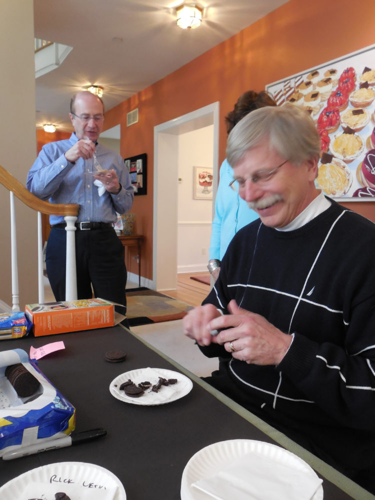
This year’s Oreo Cookie Contest started off quietly enough, with these three boys carefully plotting their strategies and taking their bites.
The contestants kept on coming, and the bitten Oreo Cookie Contest entries rapidly piled up on our kitchen table.
Then on Sunday these two biters arrived, Jill and Rick. This was Rick’s first visit to my Open Studio, and he was a willing participant. He had talked about coming since last year, so he was ready, as was Jill.
After taking a look around, Rick sat down at the table and started chomping down, holding his plate under his chin to catch the crumbs. (Notice he didn’t have an audience yet…)
He was so disappointed in his first entry, that we encouraged him to try again. He got fancy with this cookie, and basically crushed it… and let all the crumbs fall out of his mouth. Clearly he knew I liked crumbs.
As Rick was assessing his entry, and writing his name on the plate so I would know which bite was his (as if I could forget!), he described his entry as regurgitated crumbs (spoken like a true doctor!).
The regurgitation comment really caught us by surprise. You can see his wife Jill laughing hysterically in the background at that comment.
It was a very funny moment that had us all belly laughing, including Rick.
Bonnie was having a hard time holding it together at the other end of the table.
All of this biting worked up Rick’s appetite for carrot cake, and he suggested I sponsor a second contest…
Rick certainly has a knack for biting Oreo Cookies, which you can see here (maybe carrot cake not so much…). How he got all that icing to hang out is a mystery to me. So to Blake, the 2015 Oreo Cookie Contest Winner, I say, “Watch out!”
I’m definitely not declaring this cookie the winner – especially since I haven’t painted any of the Oreos yet. I am suggesting that it’s interesting, along with entries from many other contestants. It was a good contest and I am inspired to get to work.
However, I will say that Rick won my Funniest Contest Participant Award! And for that, there wasn’t even a close second.
After 2 days visiting hundreds of exhibits during Armory Art Fair Week, there’s one interactive installation that stands out above all others – and that’s Art Vending Machine $1 Paintings.
Booth 512 on Pier 94 at the Armory Show, Gallerie Forsblom, Helsinki, Stockholm
I love it! Apparently so does the Guggenheim who is thinking about purchasing this.
Located on the 94th Pier (Booth 512) at the grandaddy Armory Show (through Sunday, March 4), Art Vending Machine $1 Paintingsattracted long lines whenever it was operating. The novelty of watching an original piece of artwork pop out of a huge vending machine for $1 was irresistible.
Simply put in your dollar, choose the concept you want from the list, tell the representative who talks to artist through a cardboard tube in the wall, wait a bit, and out it comes. Then you have your photo taken with your original art.
The buyers all walked away with big grins, proudly holding their abstract compositions, many commenting they were going to frame their creations.
This was one of the most innovative and memorable installations I have even seen at an art fair. It has special appeal to me as a painter of vending machines (Icons of the Candy World, Icons of the Chip World), my most recent being Super Foods.
“Super Foods”, Vending Machine Series, by Beverly Shipko, Oil on wood panel, 5 x 7 inches
With 10 paintings in the series so far, Art Vending Machine $1 Paintings opened up the world of possibilities to explore further. I plan to go beyond broccoli and think broader. As the metaphorical visual below implies, this theme can incorporate any material – even the kitchen sink.
I decided to repaint several rooms in our house as a reward for decluttering (aka Kondo-ing) them – my Oreo Cookie brown studio, terra-cotta red dining room, and dark green master bedroom.
The dark earthy palette I saw on HGTV and TLC (think Trading Spaces) is wearing thin after 8 years. I’m ready to return to light and airy rooms, which will open up the space.
I thought this would be a relatively easy task since I had selected a limited palette. But there are so many shades of “white”! Over 50 in just one corner of the online Benjamin Moore chart for the white family.
Being an artist, people assume painting skills will translate into decorating skills. But I decided decorating is an acquired skill, at least for me.
Helpful Hint: The large 8 x 8 inch color sheets you see here can be ordered relatively inexpensively from this link at www.myperfectcolor.com. It certainly beat paying more money for sample size paint cans, brushes, and poster boards, not to mention the time and mess of painting everything. I confess to placing 3 orders so I could have duplicates of my final choices and put them around the room in different light and at different times of day.
I tried plain white, super white, warm creamy whites, cool whites, taupe whites, grays, blue-grey whites, creamy-grey whites. Who knew?
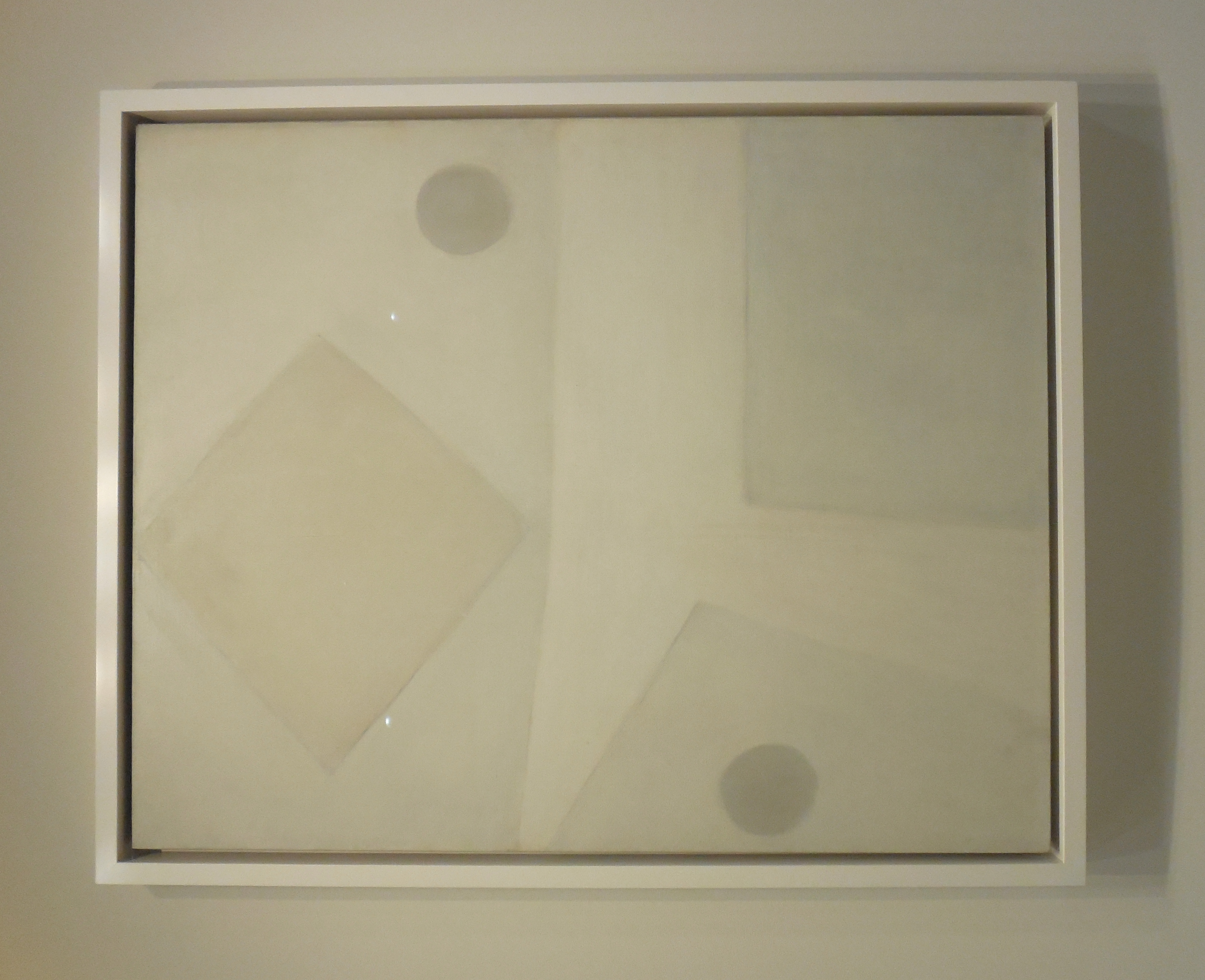
The answer is that Agnes Martin knew.
Paintings by Agnes Martin at the Guggenheim, Courtesy of artnet®news
Can you see why I was thinking about my color samples when I walked through this exhibit?
Agnes isn’t a decorator, however, but an artist who is having a retrospective (through January 11, 2017) at the Guggenheim Museum – itself a masterpiece of swirling whites.
This show feels like it was put together to showcase the spiral design of Guggenheim.
Agnes says that she wanted to paint emotions, just as joy, happiness, love, and peace. Clearly Agnes had a mystical and spiritual bent that belies her classification as a minimalist. And white has the connotation of purity, innocence and perfection, which brides traditionally wear. These paintings were among her late works.
Agnes Martin paintings, courtesy of the Guggenheim Museum
I walked away from this show with a new appreciation for the power of white. I also had many ideas of paintings for the huge wall in the master bedroom (non food too!), especially from her early less structured paintings.
What I learned from Agnes Martin is that white doesn’t necessarily have to have that feeling of sterility associated with hospitals and dental offices. Several friends warned me away from bright white rooms. But white can be warm, friendly and happy.
Do I dare paint my studio Super White to showcase my paintings? What do you think?
In color psychology, white is the color of new beginnings and wiping the slate clean. That just about sums it up. I’m ready for a clean slate, literally and figuratively. So wish me luck sorting through all the whites!
Unfinished? Or finished? I always struggle with this.
That was the debate in Saturday night’s New York Philharmonic program notes for Schubert’s Unfinished Symphony. A stack of unfinished music, described by some as “torsos” or fragments, were found when Franz Schubert’s life was cut short by syphilis at age 31. Schubert sent this particular piece to a friend who kept it hidden in a drawer for 40 years.
Dubbed Unfinished by posterity, the artist’s own intentions are unclear. Originally called Symphony No. 8 in B minor, D.759, the two movements we heard certainly sounded finished – and beautiful – to me (judge for yourself), although it departed from the typical four movement format of Schubert’s era.
Was Schubert planning to come back to it and flesh it out into four movements? Or did Schubert consider this piece finished since he put the score down long before his death? Were other movements simply lost?
The road is littered with unfinished creative work, whether it’s music (Mozart Requiem), painting (Da Vinci’s sketchbooks) or architecture (Gaudi’s Sagrada Familia). As an artist who paints half-eaten food that are inherently unfinished, this is a subject that intrigues me: When is a painting finished? The simplest answer is when the artist says it’s finished. Only life isn’t always that simple, as was the case with Schubert.
This complex subject was tacked by the Metropolitan Museum in the Met Breur’s inaugural show Unfinished: Thoughts Left Visible. Although the show closed in September, it made a lasting impression on me – and on mostly everyone else who saw it, especially those close to the creative process.
I’ll cover a few of the highlight and issues, beginning with this hauntingly beautiful metal point, drawing and oil of Saint Barbara by Jan Van Eyck (1437) on the first floor of the show. Is this an exquisitely drawn preparation for an unfinished painting, or a finished drawing with a touch of color?
Leonardo Da Vinci painted this elegant Head and Shoulders of a Woman (1608-14) with beautifully disheveled hair (mine should look this good!) using oil, earth, with white lead pigments on poplar. Note how finely painted the delicate features of the face are relative to the sketchiness of the hair. Unfinished perfection?
This dramatic El Greco, The Opening of the Fifth Seal (1608–14), is an unfinished painting that was heavily damaged and restored, and has been cut down from its original size. Yet the Met thought enough of it to purchase it for their permanent collection.
The concept of non finito (a theme in this show, literally Italian for unfinished) can be applied to this later Rembrandt van Rijn of his companion Hendrickje Stoffels (mid 1650s). Rembrandt was an artist who experimented with unfinished paintings, and came back to this one over a period of time. Perhaps he intended to leave this unfinished, or was content to leave the rough hands and drapery as is since it is an informal portrait.
It’s interesting to look at late Rembrandt, and late work of other artists for that matter (Turner is coming up), which tend towards less detail rather than more. Why, you might ask? Is it simply that elder artists suffer from declining vision and health? Perhaps artists feel they only need to capture the essence or spirit of the subject, having already established their technical skill over their distinguished careers. Or maybe they paint more for themselves at this point in their life cycle.
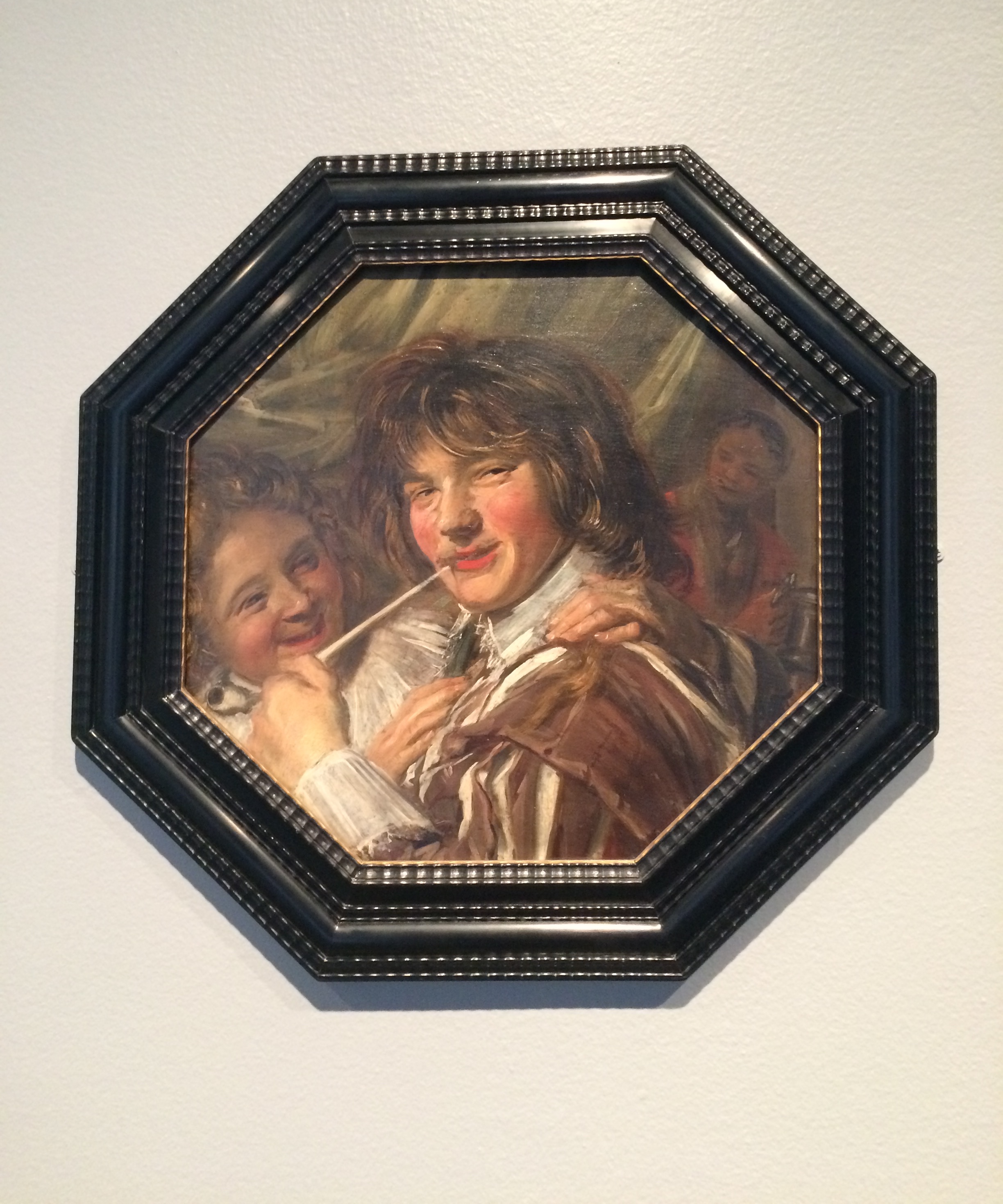
Contrast late Rembrandt with the exuberant mature style of another Dutch painter, Frans Hals, in The Smoker (ca 1625-27) with its free, sketchy style and magnificant brushwork. The immediacy and perceived realism of these paintings works best when seen from a distance. I personally find the rough style of late Hals exciting and am captivated by the loose brushwork.
This clearly unfinished self-portrait by George Romney, 18th century British painter, was admired by his friends and offspring for its spirit, yet questioned for its incomplete state. How I wish I could carry this off! Yet this was prized by several generations of Romeys.
And now we come to my favorite room of the entire show. A lovely room full of foggy, ethereal mood paintings typical of late William Mallard Turner, including Sun Setting Over a Lake (ca. 1840) and The Thames Above Waterloo Bridge.
These mature works, which were found in Turner’s studio after he died and donated to the Tate as part of the Turner Bequest, verge on being pure abstractions with their free brushstrokes not generally associated with painting of this period. They were admired for their non finito aesthetic, and foreshadow the Impressionists and the abstract art to come out of America (Helen Frankenthaler, for example).
On the second floor of the show, Picasso greets us on the second floor with a black and white painting of The Charnel House (1944-45), which he referred to as the massacre. While the specifics remain somewhat of a mystery today, this unfinished work with areas of canvas showing together with compositional changes, reminded me of Picasso’s Guernica – a MOMA favorite for so many years – in its subject and grey palette befitting the darkness of war. Picasso thought this was finished enough to donate to National Association of Veterans of the Resistance in 1936.
A second Picasso work on paper seems conceptually like a two-part art class assignment (color first, then black and white), but somehow works as a painting.
Next I enjoyed these two clearly unfinished works. The first is this charming Vincent Van Gogh of a Street in Auvers-sur-Oise, painted in 1890, a year before he died, perhaps explaining the bold blue strokes of the sky set against the raw canvas. The second is Gustav Klimt’s Posthumous Portrait of Ria Munk III, with bold patterns and colors swirling around the drawn figure – a definite crowd pleaser.
Then the exhibit shifted to more contemporary 20th century work, including Jackson Pollock’s Number 28, 1950. Pollock poured and threw paints in a seemingly haphazard manner onto canvases placed on the ground (rather than an easel), without a central subject. The paint literally runs off the edges of the canvas, implying a sense of infinite time and space without an ending.
We see Alberto Giacometti with Annette (1951) who almost made a career out of reworking and reworking paintings for years in a deliberately unfinished way, so that the creative process was evident to viewers. In fact, Giocometti never thought any of his works were finished!
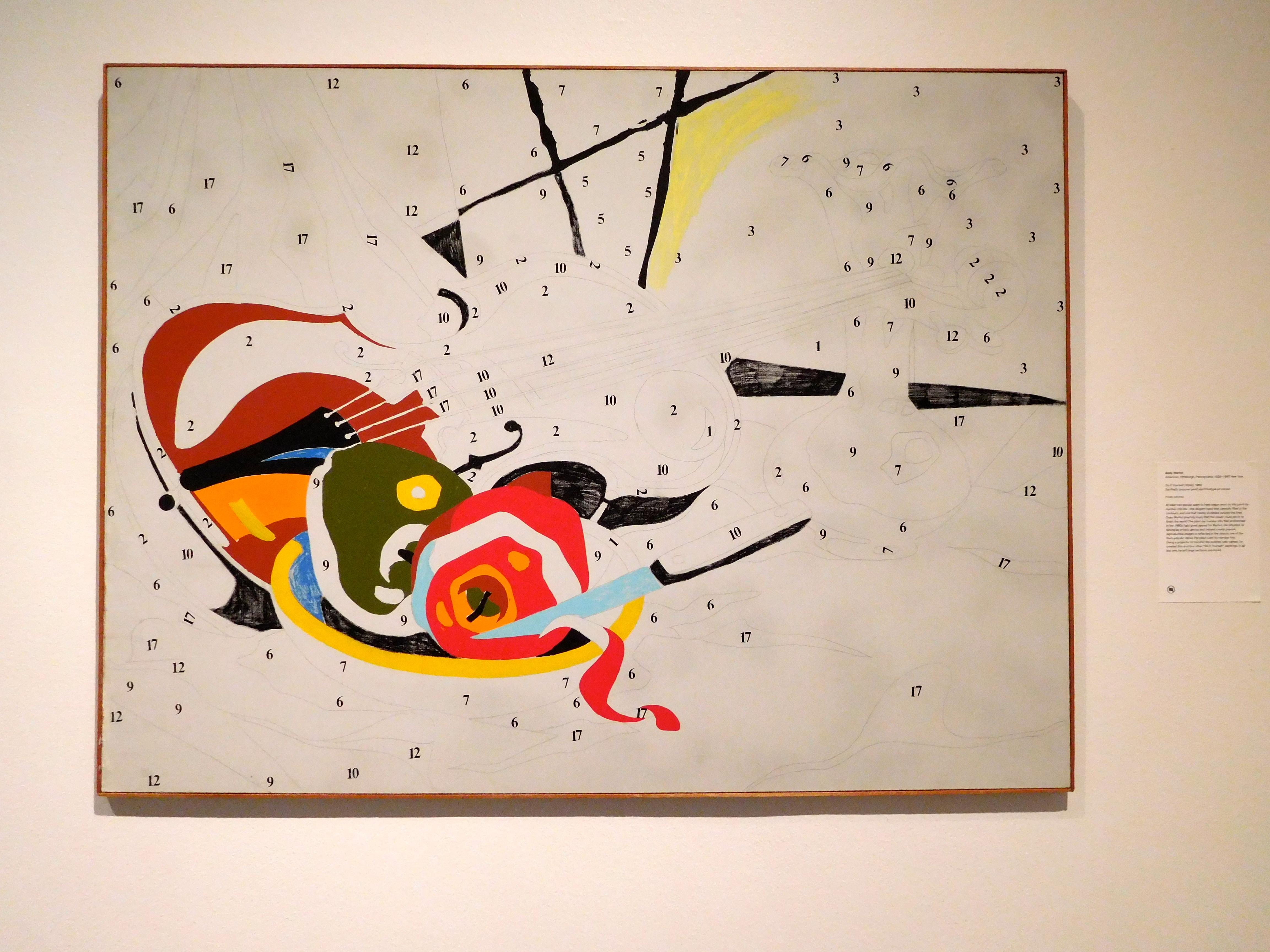
I smiled when I saw the next juxtaposition of these two works that reminded me of all my paint-by-number kits that I enjoyed as a child. Andy Warhol’s Do-It-Yourself (Violin), 1962, and Kerry James Marshall, Untitled, 2009 (who currently has a major show at Met Breuer) brought back a lot of pleasant memories. Marshall follows the time-honored tradition of depicted an artist holding a palette while working on a painting – in this case, a paint-by-number painting. What a painting in a painting!
The theme of the show then shifted to decay and decline with works such as this seemingly disintegrating sculpture by Urs Fischer “2” (2014) in cast bronze, oil paint, palladium led, clay bole, child gesso and rabbit-skin glue. The process involved creating and destroying, suggesting decay and perhaps sexual violence.
Hans Hoffman went even further in painting with this creation and deconstruction pattern process in Woman, I (1950-52). Hoffman returned to this subject time and time again, scraping, wiping, blotting, with a disregard for the outline of the form (unlike Klimt) that resulted in a sort of visual chaos that was intentional.
Jean-Michel Basquiat builds on the notion of chaos and irreverence in Piscine Versus the Best Hotels (or Various Loin), 1982. The painting seems to be coming apart at the seams with its exposed stretcher bars, irregular joints, and rather quickly attached photocopies. Words and puzzling images that appear to crash into each other, reminding us of street art and graffiti.
Rodin’s elegant sculptures of hands greet us in the last large room in this show of various sculptures. Smooth delicate carvings of fragmentary hands are set again contrasting textures of rough hewn stone, harking back to Michelangelo’s Unbounded Slaves and Medici Madonna in the non finito spirit.
Menardo Ross further explores the notion of depicting body parts in a series of eerie marble heads lying on a dark stone platform. I spent a lot of time wandering around this room, which was particularly interesting aesthetically and conceptually within the context of this show.
This was a provocative exhibit that received less than enthusiasm reviews from the critics, hinting that this show wasn’t enough of a revolutionary breakthrough inaugural contemporary show. The critics seemed to fault the Met for drawing from its encyclopedic collection, although I do agree that the two floors felt like two separate exhibits. The New York Times review called it Thinking Inside the Box, hardly intended as a compliment. But for all of us interested in the exploration of the creative process, it was fascinating!
In the spirit of this exhibit, I proudly show you one of my incomplete paintings, which has been waiting patiently in my studio. Normally I wouldn’t have posted this one so early in the process, but I gave myself permission after spending a lot of time in Unfinished.
There are a number of unfinished paintings in my studio. Why? Obviously, I’m still alive, so that’s not the reason. And I’ll go on record saying some are in the concept stage, and nowhere near completed. Certainly there were plenty of distractions the last few months with many family trips and a daughter settling back in New York after living away for many years, perhaps contributing to a lack of focus and a painters (and blogging!) block.
Sometimes you really never know why a painting remains unfinished. Here’s one that sat around for a long time after a little visitor ate the subject! Fortunately I had taken a photo of this Oreo. True story.
My personal insight after seeing this show: I think I should be more tolerant of my own unfinished works. There’s nothing to be embarrassed about. And it’s ok to stop before every i has been dotted and every t has been crossed. In fact, it’s an area I want to explore.
What I took away from Unfinished was that I am just carrying on an age-old tradition going back centuries. And a glorious one at that.


